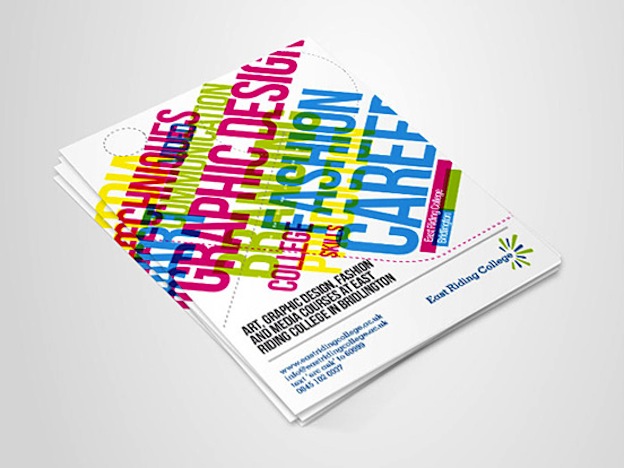
The funny thing is that automatically when most people think of a brochure, they think of a trifold brochure, you know that brochure that fold up into 3 and fits in that long envelope? Are you nodding your head, I thought so!
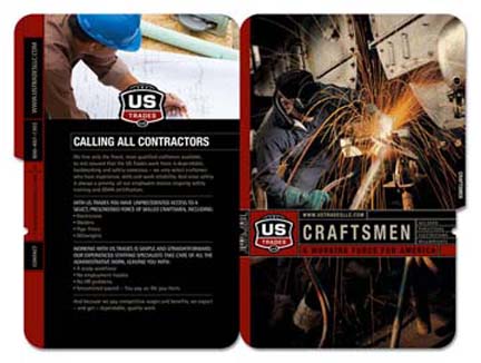
One major thing that I have noticed is that designers think that they have to stick to the panel, I guess it is a throwback to the childhood teacher saying, only color in the line. BUT, in order to do some great design, you need to jump out of the line for this.
Are you interested in knowing how to make your next brochure design pop? Do you really want to wow your client’s?
Here are 3 tips to get your starting in the unboring your design process!
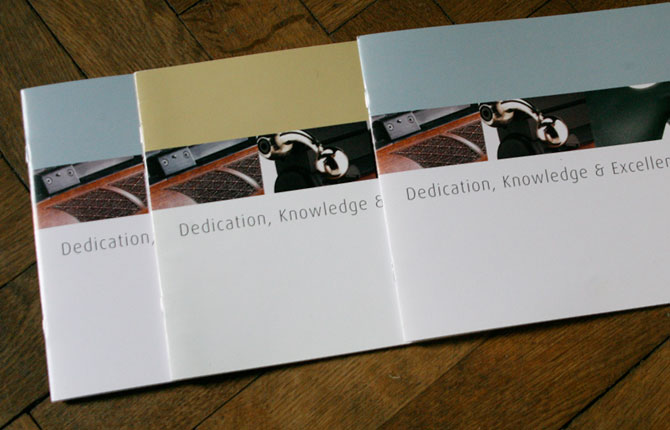
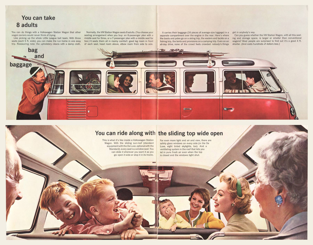
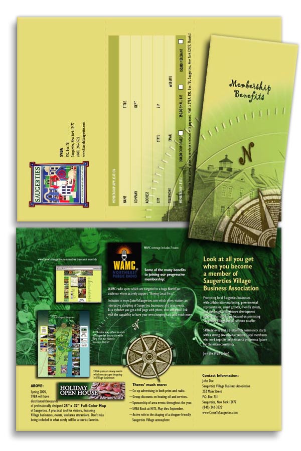
1. Unite the panels. Either have an image go across more than one panel or page, or create some background elements that span more than one column. Also, instead of confining your text to one panel, have it span two:
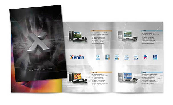
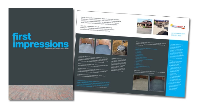
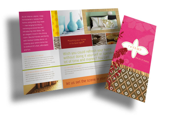
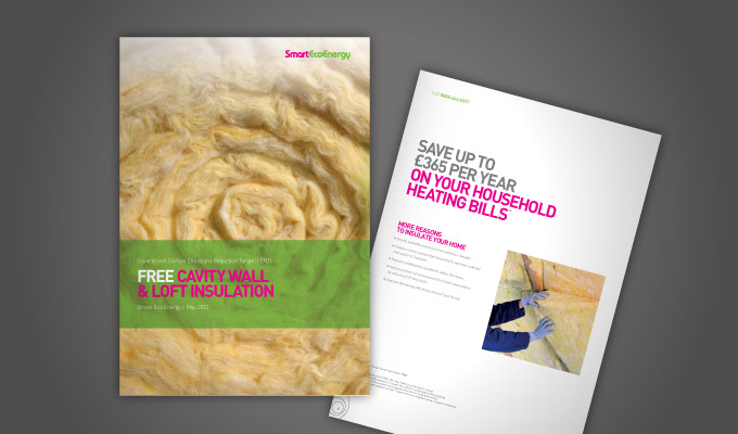
2. Cover your brochure with something big. That could be big image or big typography.
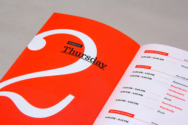
3. Crop images super close, or at interesting angles. Give a person a feel for the texture of the amazing wool the products are made from, get your readers in on the action, or perform extreme cropping so you can zoom in on an interesting element.
